Lighting & Kelvin Consistency: The Architect’s Key to Visual Harmony and Productivity
The Silent Architect: Lighting as a Design Material
In the world of high-end architectural design, lighting is often described as the "invisible material." It shapes volumes, defines textures, and more importantly, dictates the emotional response of a human being to a space. However, one technical detail frequently overlooked—until it is too late—is the coordination of color temperature, professionally known as Correlated Color Temperature (CCT), measured in Kelvin.
At AL-SAMA, we don't just manufacture signage; we consult on the visual ergonomics of branded environments. We have seen how a stunning, multi-million dollar corporate lobby in Mumbai can be undermined by a single signage logo that glows at a cool 6000K while the surrounding architectural stone is bathed in a warm 2700K ambient wash. This "Kelvin Clash" creates visual friction, degrades brand perception, and negatively impacts employee productivity.
This guide explores the strategic importance of Lighting & Kelvin Consistency from the perspective of leading industry consultants, architects, and execution partners.
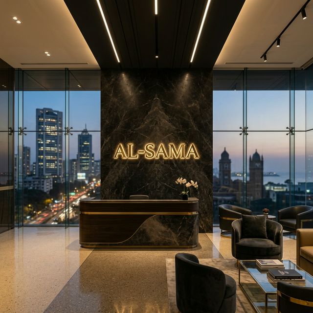 Consistency in color temperature defines the premium quality of a space.
1. The Science of Color Temperature: Beyond Just Brightness
Understanding Kelvin is fundamental to achieving architectural harmony. Color temperature determines the "feeling" of the light, influenceing everything from our biological rhythms to how we perceive material quality.
- Warm White (2700K - 3000K): Evokes comfort, luxury, and intimacy. Ideal for hospitality projects, premium residential towers like those found in South Mumbai, and boutique reception lounges.
- Neutral White (3500K - 4000K): Encourages focus and alertness without the sterile feel of laboratory lighting. This is the "Goldilocks" zone for modern corporate workspaces and conference rooms.
- Cool White (5000K - 6500K): Mimics overcast daylight. Primarily used for high-precision environments, back-of-house areas, and specialized retail where absolute clarity is required.
The challenge for the architect is not just choosing one temperature, but ensuring that every piece of the environmental puzzle—from the recessed ceiling lights to the internally illuminated branding—speaks the same visual language.
2. Why Lighting & Kelvin Consistency Matters in Branded Environments
Brand Integrity and Materiality
Your brand's color palette is not just a CMYK or Pantone value; it is a light value. A brand logo executed in PVD gold or brushed brass will look rich and prestigious under a 3000K warm halo. Under a 6000K cool light, that same premium finish will appear greenish, sterile, and fundamentally "cheapened."
Visual Harmony in Large-Scale Facades
When viewing a building facade at night, the human eye is remarkably sensitive to variations in light color. If a building’s facade enhancement utilizes 4000K neutral strips while the rooftop marquee is set to a "standard bright white" (often 6500K), the entire structure loses its architectural unity. As premium execution partners, we coordinate with the electrical and architectural teams to ensure that the signage solutions match the facade's color temperature precisely.
3. Impacts on Productivity, Aesthetics, and Employee Comfort
Workplace Mood and Circadian Rhythm
The "well-being" of a workspace is heavily influenced by lighting. Modern office branding now incorporates human-centric lighting models. If a workspace uses 4000K for workstations to boost productivity, but the surrounding glass manifestations catch glare from 3000K hallway lights, the visual jump can be jarring and cause subconscious cognitive fatigue.
Ergonomics of the Reception Area
The reception desk is the first "Branding Moment." In high-traffic corporate offices, we often recommend a slight Kelvin layering—using a warmer, welcoming tone (3000K) for the seated guest lounge and a crisper, more professional tone (4000K) for the reception desk and its associated logo. This subtle transition creates a psychological "threshold" that guides the guest journey with intent.
4. Technical Execution: Achieving Seamless Integration
Achieving Kelvin consistency across diverse signage solutions requires more than just picking a bulb. It requires a rigourous engineering approach that AL-SAMA specializes in:
- Light Auditing & Specification Coordination: We audit the existing architectural lighting specifications (IES files) before recommending LED modules.
- Binning Precision: Not all 3000K LEDs are the same. We source LEDs with tight SDCM (MacAdam Ellipse) binning to ensure that 20 different signs across 10 floors look identical.
- Luminance Balancing: We adjust the intensity of illuminated signs so they don't overpower the ambient architectural lighting, preventing the "blown-out" look in professional photography.
- Reflection Management: For glass-heavy interiors, we use diffused illumination and sun control film to prevent "hotspots" and uncomfortable reflections.
Our expertise extends to sustainable material consulting, selecting LED drivers and modules that are not only Kelvin-accurate but also energy-efficient, supporting your LEED & BREEAM certification goals.
FAQ: Lighting & Kelvin Consistency in Architecture
Q1: What is the best Kelvin temperature for corporate signage? Answer: While there is no single "best" temperature, 4000K is the contemporary industrial standard for workspaces as it balances alertness with comfort. For hospitality or luxury residential, 3000K is the gold standard for creating a premium atmosphere.
Q2: How do I ensure my signage matches my architectural lighting? Answer: Architects should provide the CCT (Correlated Color Temperature) value from their lighting schedule to the signage partner. Ensure the partner uses high-CRI (Color Rendering Index) LEDs to maintain color accuracy.
Q3: Can lighting temperature affect the appearance of my logo colors? Answer: Yes. Warmer light (3000K) enhances reds, golds, and oranges, while cooler light (6000K) makes blue and white tones "pop" but can make warm brand colors appear muddy or grey.
Q4: Does Kelvin consistency impact LEED certification? Answer: While Kelvin itself isn't a direct metric, the use of high-efficiency, consistent LED systems in a coordinated design supports "Indoor Environmental Quality" and "Light Pollution Reduction" credits.
Q5: What is "Kelvin Clash" and how do I avoid it? Answer: Kelvin Clash occurs when multiple light sources of differing color temperatures are visible in the same field of view, creating a messy visual environment. Avoid it through early-stage coordination between the architect, lighting designer, and signage manufacturer.
Final Thoughts: The ROI of Consistency
Investing in Lighting & Kelvin Consistency is not just an aesthetic choice; it is a commitment to the long-term asset value of the space. It ensures that the brand remains prestigious, the employees remain focused, and the architecture remains a cohesive masterpiece.
At AL-SAMA, we serve as your technical and aesthetic partner, bridging the gap between vision and execution.
Connect for a Professional Consultation
Are you designing a new corporate headquarters or a high-end hospitality environment? Connect with the AL-SAMA consultancy team today for specialized insights on Lighting & Kelvin Consistency, facade enhancement, and digital signage integration. Let’s build something unmistakable together.