The Psychology of Typography: Shaping Brand Perception through Environmental Graphics
The Silent Language of Letterforms
In the architecture of a brand, typography is the foundation. It is the silent ambassador that speaks before the visitor has even read the words. For the architect, interior designer, and brand manager, choosing a typeface for an environmental setting is not merely a graphic exercise—it is a psychological one.
At AL-SAMA, we understand that in a premium corporate office or a luxury retail space, the Psychology of Typography dictates how a brand is perceived: Is it authoritative and traditional? Is it innovative and agile? Or is it warm and human? As specialists in executing office branding and signage solutions, we consult on how typographic choice influences spatial navigation and brand affinity.
 Typography in environmental design is the intersection of architecture, psychology, and branding.
1. Decoding Font Psychology: The Personality of the Serif and Sans-Serif
Every font carries a subconscious weight. In the physical environment, this weight is amplified by material and scale.
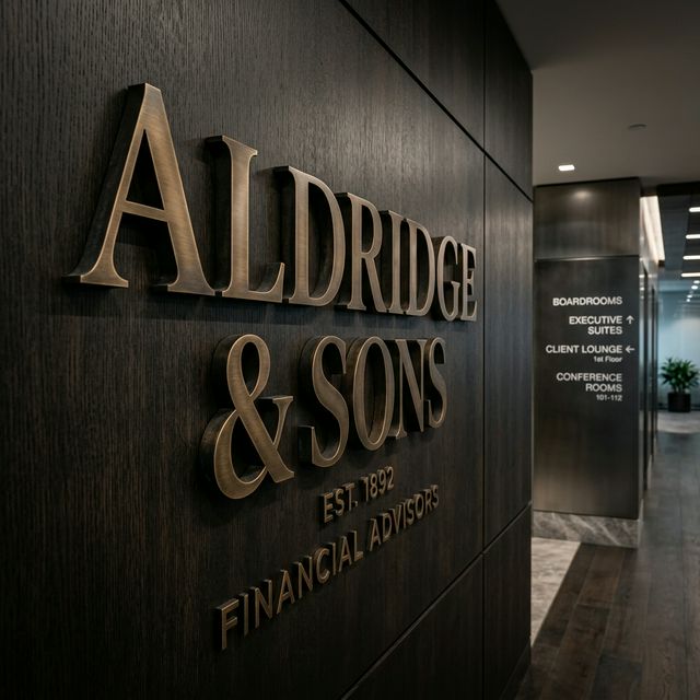
- The Authority of Serifs: Fonts like Bodoni or Garamond, with their horizontal strokes (serifs), evoke a sense of heritage, stability, and high-culture. They are the natural choice for the office reception branding of legacy law firms, private banks, and heritage fashion brands in Mumbai.
- The Clarity of Sans-Serifs: Clean, geometric typefaces like Helvetica or Inter project modernity, efficiency, and neutrality. They are the backbone of contemporary wayfinding signage because our brains process their simple shapes faster, making them essential for high-stress environments like hospitals or complex corporate campuses.
Understanding the balance between these two families allows architects to layer "narratives" within a single space—using a serif for the "Hero Logo" and a sans-serif for the functional navigation.
2. Typography in Workplace Branding: Cultivating Culture
A corporate office is more than just a place to work; it is an physical manifestation of a company's values.
Corporate Identity and Spatial Resonance
When we execute office reception branding, the typography must harmonize with the architectural materials. A bold, heavy typeface in brushed bronze feels "grounded" and "unshakeable." A fine, light-weight typeface in polished stainless steel feels "refined" and "precision-engineered." Consistency in Psychology of Typography across all floors ensures that the brand identity is felt, not just seen.
Readability in Environmental Graphics
Unlike a printed brochure, environmental graphics are viewed from multiple angles, distances, and lighting conditions. Visual ergonomics demands that typography be specified for "Glanceability." We help designers choose font weights that prevent "clogging" (where letters blur together) under the harsh glare of lighting environments or reflections on glass manifestations.
3. The Psychology of Wayfinding: Guiding with Intent
Wayfinding is the art of solving problems before they occur. The Psychology of Typography plays a critical role in user experience:
- Information Hierarchy: By varying font size and weight, we guide the eye. The "Destination" is bold and large; the "Directions" are lighter and supporting.
- The "Nudge" Effect: Directional arrows and symbols must match the "personality" of the font. A soft, rounded font paired with a sharp, aggressive arrow creates psychological dissonance.
At AL-SAMA, our signage solutions are engineered for this cognitive ease, ensuring that visitors feel confident and calm as they move through your space.
4. Branding Psychology in Retail and Facades
In the competitive retail landscape of cities like Mumbai and Delhi, your facade is your first handshake.
The Threshold Moment
The typography on a retail storefront isn't just a name—it’s a filter. It tells the customer if the store is "affordable and fun" or "exclusive and bespoke." When we consult on facade enhancement, we analyze how different typographic materials—such as halo-lit acrylic vs. solid metal—interact with the Psychology of Typography to attract the right demographic.
FAQ: Psychology of Typography in Architecture
Q1: Why is font choice so important for office signage? Answer: Because it is the primary touchpoint for a company's culture. A font that is too "playful" can undermine a professional service firm, while one that is too "stiff" can alienate talent in a creative agency.
Q2: How do I choose a font that is readable from 50 feet? Answer: Look for high-contrast letterforms with open "counters" (the spaces inside letters like 'e' or 'a'). Sans-serifs are generally more legible at a distance in outdoor settings.
Q3: Can I use my brand's digital font for physical signage? Answer: Not always. Some fonts designed for screens look "thin" or "weak" when fabricated in 3D. We often recommend a "physical weight" adjustment—slightly thickening the strokes for metallic fabrication or LED illumination.
Q4: Does typography impact wayfinding in large hospitals? Answer: Critically. High-legibility, high-contrast typography reduces "wayfinding anxiety" in patients, which actually lowers physiological stress levels. This is a key part of inclusive architectural design.
Q5: What material best complements a minimalist, modern font? Answer: Satin-finish aluminium or matte-black acrylic are excellent for "modern" fonts, as they absorb light rather than reflecting it, keeping the letterforms crisp and clear.
Conclusion: The Architect’s Typographic Legacy
Typography is the most intimate point of contact between a human being and a building. When the Psychology of Typography is mastered, the building speaks with a singular, authoritative voice.
At AL-SAMA, we don't just cut letters; we curate identities. Our role is to ensure that the vision of the architect and the brand strategist is translated into physical form with absolute typographic integrity.
[Elevate Your Branded Environment]
Is your project's typography communicating the right message? Connect with AL-SAMA today for a consultation on Psychology of Typography, office branding, and premium signage execution. Let’s make your project speak the language of excellence.